
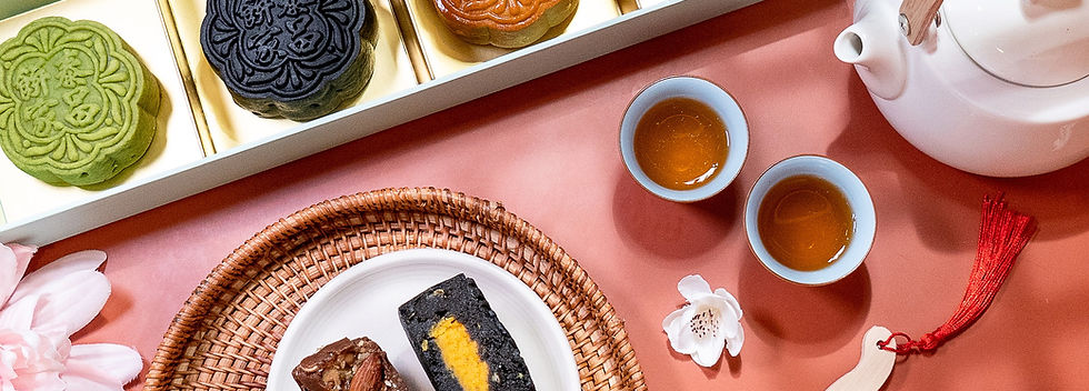
Tai Cheong Bakery
Brand Refresh | Product & Packaging Design
Design Brief
Tai Cheong Bakery, a beloved traditional tart shop from Hong Kong, wanted to connect with a younger audience as they expanded into Singapore. Our team was invited to revamp the entire brand for this region while honoring Tai Cheong’s heritage.
For this project, I led the visual refresh by introducing playful illustrations and a new shade of yellow to complement their signature green, bringing a youthful warmth to the brand while keeping its classic feel. This approach shaped the new packaging design, helping Tai Cheong present a friendlier, more vibrant identity to a new generation of customers, while staying true to the taste and story people love.

Before
After
Photo Shoot
Packaging Design
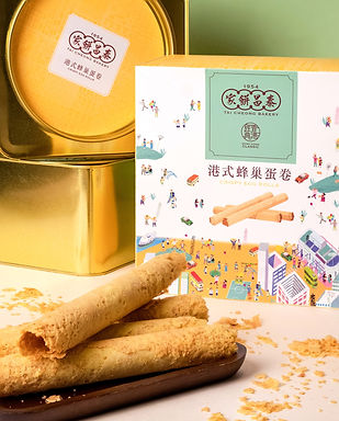
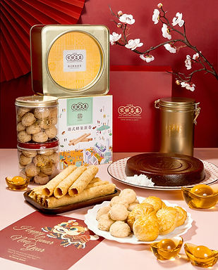
For Tai Cheong’s New Year campaign, I redesigned their hero product, the eggroll, using illustrations paired with their signature green and a soft yellow to bring a fresh yet familiar feel to the brand. The illustration concept, “Hong Kong Neighbourhood,” captures the warmth of 90s streets—a personal memory of playing with childhood friends—inviting customers to reconnect with simple joys and share that warmth with every gift box.


Color Theme Development
To maintain brand consistency while introducing a modern, cohesive color palette that would be versatile across digital and print mediums, enhancing Tai Cheong’s appeal to younger audiences without alienating its loyal customer base.
Outcome & Impact
This color system has been implemented across Tai Cheong’s Singapore expansion campaigns, seasonal menus, and social media content, maintaining visual consistency while refreshing the brand’s appeal to a younger demographic.

Before
After
Photo Shoot
Brand and Product Refresh
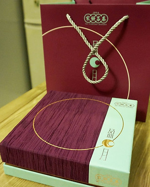
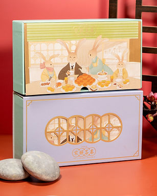
Tai Cheong is a beloved heritage brand in Hong Kong, and I’ve always thought about how to make it feel younger while preserving its heart. For their annual mooncake campaign—which hadn’t seen a packaging refresh in years—I led a product design revamp, starting from flavour selection to photo shoot concepts.
To align with Mid-Autumn Festival traditions, I used playful illustrations of a rabbit family and chose a warm purple palette, bringing a sense of celebration and family connection while keeping Tai Cheong’s brand spirit alive in a fresh, joyful way.