

VAVA ICE CREAM CAKE
Rebrand | Logo, color theme and package design
Design Brief
Vava Designer Cake is a well-known Toronto-based cake brand with a strong foothold in the Chinese market. They decided to expand by launching a new ice cream sub-brand targeting Western families and kids in downtown Toronto.
I was tasked with creating the logo, color theme, packaging, and visual templates for this fresh, fun brand while staying true to Vava’s core branding.

vava cake logo

vava ice cream
Logo Design
The original Vava logo features a simple angel in soft gold, symbolizing family and warmth. For the ice cream sub-brand, I kept the angel concept but made its clothes an ice cream cone to highlight the product. I swapped gold for light blue to create a fresh, playful feel while linking it to the main brand.

Color Theme Development
Vava Designer Cake’s original palette uses soft gold, brown, and light pink, conveying elegance and warmth.
For the ice cream sub-brand, I kept a light gold to connect to Vava’s heritage, then added three shades of blue to evoke coldness and freshness, giving the brand a fun, youthful vibe.
Package Design

Design idea
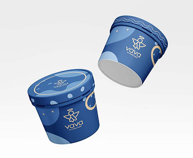
3D mock up
I designed the first ice cream cup package, a key visual touchpoint that sets the brand’s tone. Using the chosen gold and blue palette,
I incorporated dynamic shapes representing clouds and sky to evoke freshness and playfulness, establishing a clear visual guide for future products.


illustration design
Mock up
For the ice cream box, I used a blue background featuring an illustration of a little angel and a cat standing on a cloud under a starry night sky. This design reflects the “Sweet Dream Story” ice cream set, adding a whimsical and cozy feel to the packaging.
Key Visual
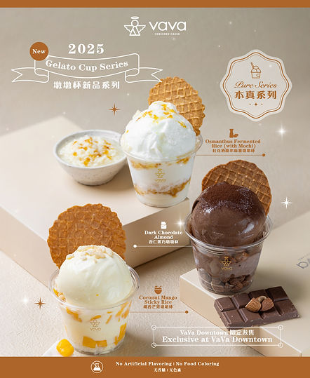
Limited product
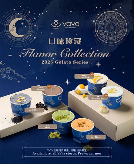
General product
Print and Digital Production
I created two key visuals: one for the general product line and one for a limited edition.
The general visual features the blue sky and constellation patterns, tying into the brand’s fresh, playful theme and highlighting each
ice cream flavor uniquely.
For the limited edition, focusing on warm chocolate and coconut flavors, I used brown and orange tones to differentiate it while keeping the star motif and consistent fonts to maintain brand cohesion.
Update visual of VAVA DESIGNER CAKE


Hero product

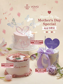
Festival Product
Outcome
The ice cream sub-brand successfully bridges Vava Designer Cake’s elegant heritage with a fresh, playful identity that appeals to Western families and kids. The cohesive branding—from logo to packaging and key visuals—has received positive feedback for its clear connection to the parent brand while feeling fun and approachable. This new visual identity positions the sub-brand strongly in Toronto’s competitive downtown market.
For Vava’s new hero cakes and festival cake series, I create key visuals that highlight the cake’s flavor and appearance with a unique concept to make each one special. For festival cakes, I focus on designs that clearly evoke the spirit and traditions of the celebration.