

BURGER KING HONG KONG
Brand Localization Campaign
Design Brief
As SSP Asia Pacific took over Burger King’s Hong Kong operations, I was tasked with localizing global brand assets for the local market. Working under strict global brand guidelines, I created visual content for social media, print promotions, and local campaigns—balancing Burger King's bold identity with local market appeal. This was a key highlight in my SSP career, blending creativity with strategic brand execution.
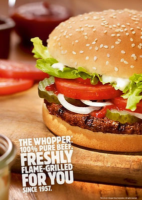

Original Design
Burger King's global visual style uses bold typography, vibrant food imagery, and clear, direct messaging. Unlike the more detailed and traditional approaches of typical Hong Kong fast food campaigns, BK’s aesthetic focuses on simplicity and impact. In this project, I adapted that bold visual language to suit local tastes while staying true to the brand’s identity.
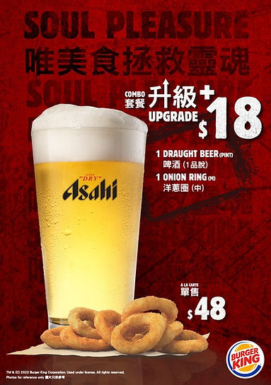
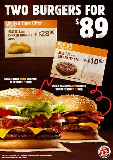
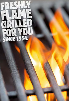
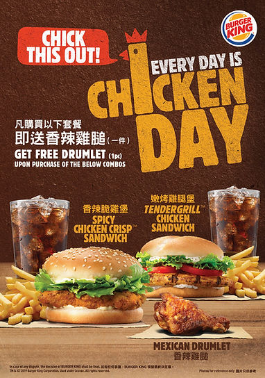
Key Visual - Generic Promotion
For these Burger King Hong Kong promotional visuals, I recreated the brand’s bold, high-impact style using dark backgrounds to highlight the food and create strong contrast. I selected fonts that align closely with the Burger King brand for visual harmony, and built all key visual elements in Photoshop.
As there are only two Burger King locations in Hong Kong, resources were limited — which meant relying heavily on creativity and self-initiative. I worked closely with the marketing team, pitching concepts and executing the full visuals from idea to final artwork.
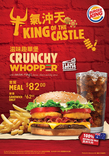
Key Visual - Festival Promotion
Brand Localization
Hong Kong celebrates unique festivals like Lunar New Year, which posed a creative challenge when localizing Burger King’s global brand for a culturally significant promotion — without direct support from HQ.
To align with the festive tone, I used deep red as the base color and adapted typography within the limits of Burger King’s brand guidelines. Despite the restrictions, I successfully created a campaign that felt both culturally relevant and visually aligned with Burger King’s bold identity, delivering a strong example of effective brand localization.
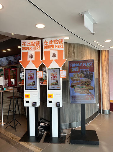
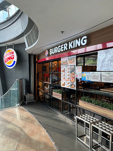
In-house print production
Working on the Burger King Hong Kong account under SSP Asia Pacific was one of the most defining experiences in my design career. Unlike many international brands with localized support, we had to creatively adapt the global Burger King identity to fit the Hong Kong market — often with limited resources and tight turnaround times.
From designing social media graphics and print materials to creating seasonal promotions for local festivals like Lunar New Year, I had to balance strict brand guidelines with the cultural nuances of a distinctly different market. This required not just creative thinking, but also a strong understanding of visual impact, brand consistency, and local consumer behavior.
Despite the constraints, I was proud to deliver visuals that remained true to Burger King’s bold and direct messaging while introducing a localized flair that resonated with Hong Kong audiences. My work was well-received by both the marketing team and local customers, proving that thoughtful design can bridge global branding with local relevance.
This project not only strengthened my skills in brand localization and creative problem-solving — it also taught me how to take ownership of a global brand’s voice while making it feel close to home. It was a valuable milestone that demonstrated my ability to deliver high-quality design under real-world commercial conditions.