
DOKI DOKI Floral Studio
Rebrand | Logo, color theme and brand-guideline
Design Brief
When I was the solo Senior Graphic Designer at Sweven Media, I led the complete rebranding of Doki Doki Floral Studio, a small handcrafted floral business looking to evolve into a premium brand with a stronger storytelling identity. The goal was to retain their handmade charm while elevating their presentation to match a higher-end, narrative-driven product offering.
Rebrand | Step 1

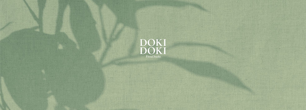
Before
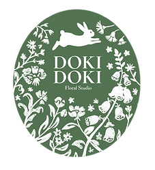
After
Logo Design
The original logo featured a heartbeat line forming a heart-shaped flower — a nod to the Japanese meaning of “doki doki” (heartbeat). While charming, the horizontal format lacked adaptability and didn’t convey the brand’s premium aspirations.
I reimagined the logo by introducing a whimsical rabbit character surrounded by hand-drawn flowers, evoking a “secret garden” theme. Unlike the common floral motifs used by many competitors, the rabbit created a unique, ownable character that could expand into packaging, campaigns, and merchandising.
Rebrand | Step 2
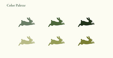
Color Theme Development
Previously, Doki Doki had no defined brand palette beyond a black logo on cream backgrounds. To strengthen visual identity, I introduced a harmonious palette of six shades of green and one cream tone. The greens tied directly to the “secret garden” concept while offering versatility across floral arrangements and packaging.
Rebrand | Step 3
Before
After
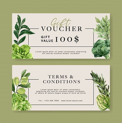
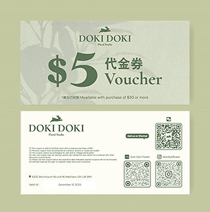
Font and Brand Guideline
Before rebranding, marketing materials like posters, leaflets, and vouchers used inconsistent fonts sourced from online templates, often unrelated to the logo. I selected an elegant typeface that aligned with the new logo and developed a complete brand guideline covering logo usage, typography, and color application. This gave the studio a professional toolkit for all future design work, ensuring consistency and brand cohesion.
Rebrand | Step 4
Before
After
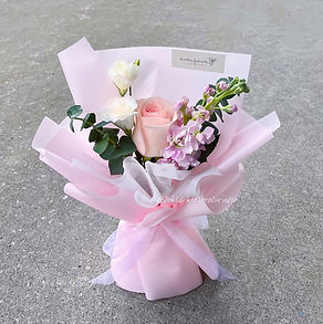
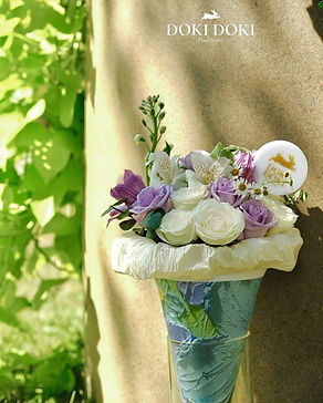
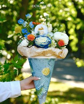
Social media & Package Design
Previously, packaging relied on basic stickers without consideration for how it could enhance the bouquet presentation. I designed custom inserts in round and rabbit shapes, paired with branded ribbons, to amplify the brand presence on each product. Packaging colors were carefully chosen to complement the bouquets, making each arrangement more photogenic and gift-worthy.
On social media, I implemented a visual storytelling approach, integrating brand colors, consistent layouts, and lifestyle photography
to highlight both products and the brand’s whimsical personality. This cohesive visual identity helped position Doki Doki as a boutique, premium floral studio while maintaining its handmade charm.
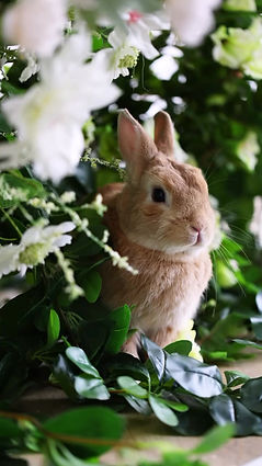
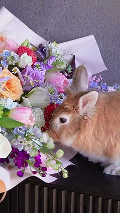
Brand Launch Video
As part of the Doki Doki rebrand, I proposed using a live rabbit to embody the brand mascot and connect it to the “secret garden” concept.
The video idea was designed to bring the whimsical and premium feel of the rebrand into real-world social media engagement.
My contribution was in concept development, set styling direction, and ensuring brand consistency in props and color palette.
Using a real rabbit in the campaign created a strong emotional connection to the new brand, making the mascot instantly memorable—so that whenever people think of a rabbit, they think of Doki Doki.
Outcome
The rebrand transformed Doki Doki into a visually cohesive and memorable brand. The new identity not only elevated their physical product presentation but also gave them a strong online presence that resonated with their target audience.