

GOGOX
Brand Character & Motion Campaign
Design Brief
GOGOX is a fast-growing logistics brand originally from Hong Kong, now expanding into markets like Singapore and Korea. As a youthful, energetic company, GOGOX offers an open and creative environment for designers to shape its evolving visual identity.
One of their signature assets is GOGO Bear, a 2D mascot used across campaigns. I had the opportunity to transform GOGO Bear into 3D, helping the brand elevate its storytelling through a fresh visual approach. I also participated in the production of their commercial video, where I was responsible for motion graphics and contributed to video editing.
This project allowed me to combine my 2D and 3D design skills, collaborate across departments, and push the brand’s visual language forward.

Before - 2D Character


After - 3D Model
GOGOX’s beloved mascot, GOGO Bear, is widely used in the brand’s social media and marketing campaigns to represent their friendly delivery service. Originally a 2D character, GOGO Bear required redrawing for each new visual, which limited its flexibility and efficiency in fast-paced campaigns.
To solve this, I converted GOGO Bear into a 3D model using Blender, giving the brand a reusable, fully rotatable asset that could easily adapt to various angles, poses, and uses. The 3D version maintains the character’s charm while allowing for faster content creation and more dynamic visual storytelling across digital platforms.
This project bridged design and practicality—enhancing both the creative possibilities and workflow efficiency for GOGOX's content team.
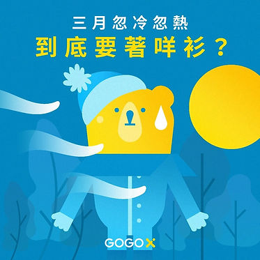

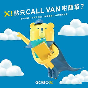
Social media illustration
While the 3D model of GOGO Bear enhanced flexibility, the original 2D GOGO Bear remains an essential part of the brand’s identity, especially for quick-turnaround and festive campaigns.
The 2D version is used widely in social media posts, seasonal promotions, and brand storytelling, where hand-drawn charm adds warmth and personality. I contributed to this effort by illustrating various 2D GOGO Bear visuals, aligning with the brand’s voice while adding playful, expressive touches to enhance engagement and relatability.
This balance between 2D and 3D assets allowed GOGOX to adapt the character across different formats and campaign needs—combining consistency with creative variety.
Commercial Campaign | GOGOX TVC & Digital Video

VISUAL DEISGN
This commercial video was part of a large-scale promotional campaign for GOGOX, launched across TV, YouTube, and various online platforms.
I’m proud to have contributed as a visual designer on this project. My key responsibilities included: designing the visual language of the video to reflect GOGOX’s brand personality, incorporating the brand’s signature yellow and blue to create a cohesive, energetic visual identity, selecting bold, expressive typography to echo the momentum and scale of the wide-angle visuals, assisting the motion and editing team by providing visual assets and design direction.
The result was a dynamic and high-impact commercial that brought together GOGOX’s brand essence and vibrant energy—connecting with audiences across multiple platforms.
GOGOX TVC Digital Video | Final Output
Being part of the GOGOX commercial campaign was a significant milestone in my design journey. As my first experience contributing to a large-scale commercial video, I was both excited and challenged to deliver visuals that matched the energy and ambition of the brand. GOGOX is known for its dynamic, youthful identity, and I aimed to reflect that through bold typography, vibrant color usage (GOGOX’s signature yellow and blue), and a playful, energetic design direction that complemented the motion and narrative of the video.
My role focused on developing the core visual assets used in the commercial — from graphic elements and animation direction to layout decisions that would unify the story across digital and video platforms. It was a collaborative process that involved working closely with motion designers, editors, and the production team to ensure that every frame aligned with the brand’s tone and messaging.
This experience not only deepened my understanding of commercial visual storytelling but also strengthened my collaborative skills. I walked away with greater confidence in managing large-scale projects, balancing creative vision with brand goals, and executing under tight timelines — and most importantly, the joy of seeing my work come to life on screen as part of something bigger.