top of page


Hong Kong Jockey Club (HKJC) Magazine Badge
Print Production
Design Brief
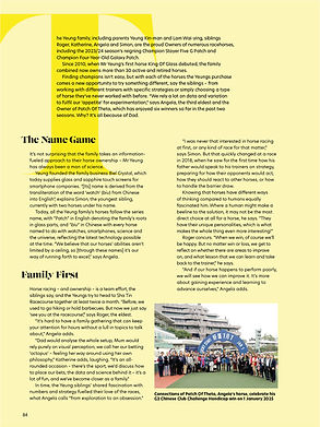
This badge is a semi-annual membership magazine for the Hong Kong Jockey Club (HKJC), featuring not only the club itself but also horse racers, local Hong Kong culture, and various other content. The edition I designed celebrates the 140th anniversary of HKJC. The key challenge was to organize diverse content into a tidy, eye-catching layout that honors the milestone.
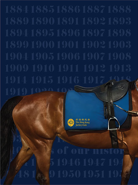
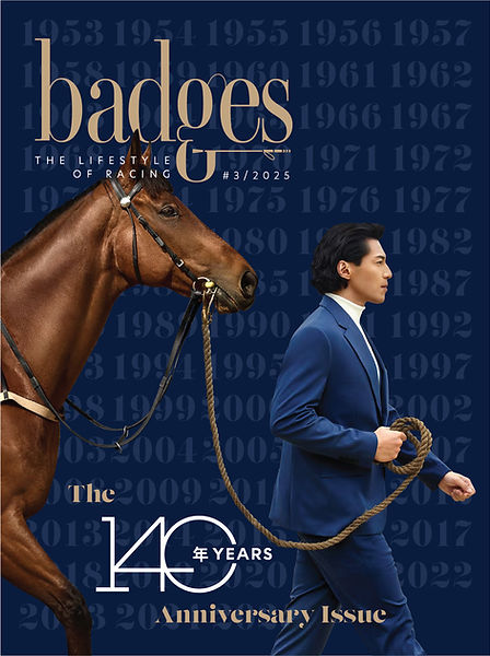
140th anniversary
Cover & Back Cover Design
The cover and back cover showcase the significance of the 140th anniversary with bold and dynamic visuals, capturing HKJC’s brand energy. The designs aim to attract readers and provide a cohesive visual frame for the magazine.


Layout
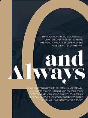
I love combining photos and typography to create a harmonious, unified visual — where words and images feel like part of the same story.
For example, in one spread featuring a photo of a man doing fitness training , instead of simply placing the image on the page, I integrated the typography directly into the composition.
Typography
I used bold typography to enlarge the "140 Annual" text as a focal point. A lot of effort went into creatively combining text and imagery, balancing fun and readability to ensure a smooth reading experience. All fonts were client-provided, so my role focused on effective use and layout integration.
Interior Layout

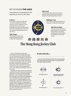
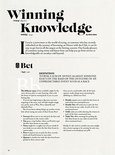
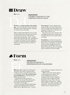
For sections with a lot of data and text but limited imagery — such as “How to Race” and the history of HKJC — I used soft, harmonious colors paired with varied font sizes to break up the content. This approach made the pages more playful and eye-catching, while keeping the information clear and enjoyable to read.


Typography
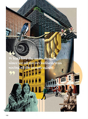
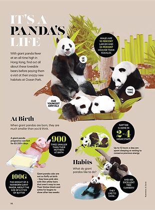
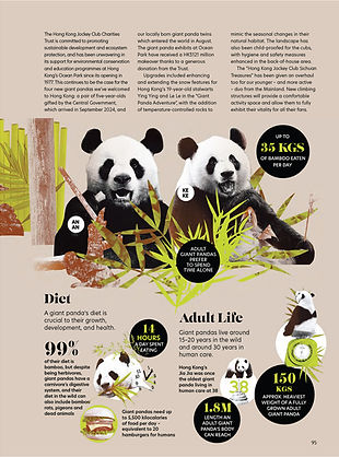
For the fun and culturally rich “Hong Kong Local” sections — such as introducing pandas and showcasing old Hong Kong — I arranged abundant photos in a playful collage style to capture a lively atmosphere. I also incorporated graphic shapes to frame and highlight unique facts, adding layers of visual interest while guiding the reader’s attention.
Colour Use
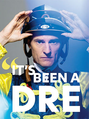
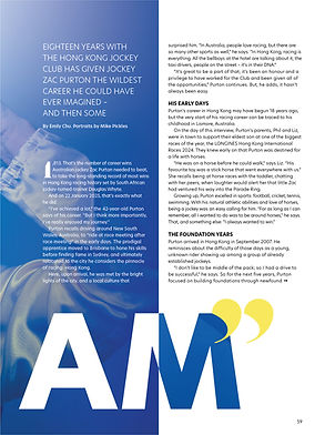
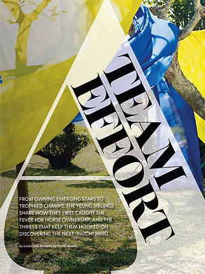
I was responsible for designing the profiles of the horse racer and the HKJC team. I used sharp, striking colors and incorporated quotes to give personality and emphasis to these sections, making them stand out within the magazine.
I developed a flexible grid system to balance text and imagery, ensuring a smooth reading experience.
This section highlights featured individuals with thoughtfully designed portraits, nameplates, and biography snippets. I arranged visual elements to emphasize the personality of each subject while preserving clean lines and easy navigation for readers. Icons and color accents were used subtly to enhance engagement.
Results
Bringing together all the varied content was challenging since this magazine serves as a half-year summary of HKJC’s activities, meaning a large amount of information needed to be clearly and attractively presented. Through multiple iterations, I worked to balance visual appeal with content clarity.
The final magazine badge was well received by the client and readers, praised for its modern yet professional look and clear presentation of content.
bottom of page